5 Elements of UX Design
UX design (user experience design) defines how your users experience your app, website, or other digital product. It’s one of the most fundamental...
In the “Under the Hood” Series, we look at how popular apps have grown loyal usage through behavioral design. Seeing the techniques in action should give you practical ideas for ways to use behavioral design in your own products.
Andrés Ugarte was working as a software engineer at Google when he found himself frustrated. He wanted a simple, personal finance app that would bring everything together into one manageable view, yet, after trying dozens of apps, they all seemed to come up short. Eventually, he decided to take matters into his own hands, leaving his job and setting out to create the money management app he’d always wanted.
Ugarte spent the next several months building Copilot and growing the user base with his cofounder Gabriel Dieguez, an engineer Ugarte had met while studying computer science in Chile. From the beginning, data security was an important goal for the pair—and one that was reinforced by early user feedback. Most personal finance apps are free, but they make money either by selling user information or by sacrificing the user experience with ads. In initial testing, Copilot users reported that they would rather pay for the app in exchange for greater privacy and a seamless, ad-free experience. The development team listened. Now, thousands of users later, Copilot has garnered a reputation as a secure and delightful way to manage your finances.
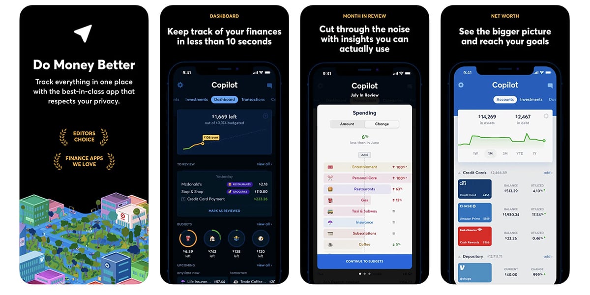
The Copilot app allows users to see and manage their complete financial picture. Investment accounts, budgets, recurring payments, credit cards, loans, and bank accounts all come together into one beautiful interface. As a result, users have a personal financial command center right at their fingertips. They no longer need to rely on separate banking, investing, and budgeting apps to get a bird’s eye view of their financial health.
It’s clear that the Copilot team has put a lot of thought, time, and money into creating such a user-centered experience. In an Apple Developer Spotlight on founder and CEO, Ugarte revealed that Copilot is a native Swift app, meaning it was built specifically for iOS and Mac users. Honing in on a single framework contributed to the app’s impressive usability and performance.
Learn more: Native App vs. Web App vs. Hybrid App: Which Is Best?
Since its launch, the app has been named to several of Apple’s top lists including, “Smart Ways to Save Money,” “Editor’s Choice,” “Must-Have Finance Apps,” and “Apps We Love.” A quick scroll through the app’s reviews also reveals thousands of happy users. Just a few minutes in the app is all you need to see that there’s something special at play fueling this success—behavioral design. Let’s take a look under the hood to take a closer look at a few of the choices Copilot developers made to keep users coming back again and again.
Asking someone to link all their sensitive financial information to an app feels like a tall order. What about hackers? How do I know if my data is safe? These are questions that naturally arise for new users of a personal finance app. Luckily, the Copilot team seems to understand this rub and responded with a couple of handy features, including demo mode.


Using dummy data, the app’s demo mode allows users to see and test the value of the app before they ever enter a single password or account number. It’s a low-stakes way to try out the features and get a feel for the app experience before committing to the setup process. In this way, the app builds trust right away and helps users overcome any qualms they might have about security.
Copilot describes itself as “an app that puts you in the driver’s seat.” The sense of control the app gives users is not just an idea; it’s built into the way the app works. One key way is through customizable sections on the homescreen. If users want to keep a close eye on their investments and transactions, for example, they can rearrange the app sections so that those screens are just a swipe right or left away when they open the app.


The designers and developers know that even something as small as too many clicks or swipes to find the right information is enough to keep users from using an app. By putting the power in the users’ hands, Copilot reduces friction and creates a sense of ease. Simple behavioral design choices, like allowing users to customize their tabs, can make a big difference in the overall app experience.
Copilot aims to attract users who are ordinary people wanting to manage their money better. With that in mind, the app needs to make complex financial information easy to understand. Copilot’s data visualization style does this well. It’s simple and intuitive. You don’t have to have a master’s degree in finance to find the app’s graphs and charts useful.


Copilot accomplishes this in two ways. First, it provides clear, concise tooltips to introduce users to the graph formats within the app. Second, it uses symbols, colors, and interactions anyone could understand. Green and up arrows are good; red and down arrows are bad—easy enough. Even without the app’s instructions, the graphs are a quick study.
These design choices work together to make consuming information in Copilot stress-free and perhaps even enjoyable. It’s not hard to see why linking accounts in the app could give you a satisfying sense of control over your financial situation.
If the goal of a personal finance app is to help you keep tabs on your spending and boost your saving, then a good app will nudge you toward behaviors that help you make progress to that end. Of course, one-way Copilot helps users improve their spending and saving habits is simply by giving them an awareness of where their money is going. But, the app doesn’t stop there. In addition to beautiful data visualization and a skimmable financial picture, Copilot also alerts users to trends or changes that might inhibit them from reaching their goals.
For example, users can elect to receive notifications for just about anything, from a low account balance to a recurring payment. This puts information users might otherwise miss—like that subscription they forgot to cancel—back on their radars and empowers them to take action. Just as the name suggests, Copilot acts like a helpful sidekick, guiding users toward their financial targets.
The Copilot app is a great example of how behavioral design can enable a digital product to attract and gain loyal users. Just a few simple design decisions work together to create an app experience users love.
Interested in learning more about how we integrate behavioral design into our apps? Let’s talk.
You might also like:
Subscribe to our newsletter.

UX design (user experience design) defines how your users experience your app, website, or other digital product. It’s one of the most fundamental...

Mobile app or web app? It’s not always a clear decision. If you survey startup founders, you will hear strong opinions on either side. The reason for...

Ramping up sales for a new product takes time. It’s a process that relies on advertising, PR, and word of mouth, and it doesn’t always happen as...