At its most basic level, a 5-Why is a process that helps people explore cause-and-effect relationships in a linear way. By asking “why,” and exploring multiple causes, organizations can choose how to effectively reduce risk and, ultimately, reduce the likelihood of recurrence. By combining solutions, organizations can see a more complete picture and effectively create layers of protection.
The process of creating a 5-Why is not new. In fact, it’s utilized within several continuous improvement models, from Kaizen to Lean and Six Sigma. And while this model is a simple tool, it can be an incredibly powerful approach to solving even the most complex problems.
There are a number of criticisms of the 5Whys model, from it being too simple, providing an incomplete picture of an issue, or that it’s unable to be used to solve more complex problems. Like many problem-solving tools, 5Whys is often misunderstood. While it is useful, it’s simply one part of a process.
A Cause Map™ diagram uses the “why” question to reveal the structure of any problem. To illustrate the evolution of problem-solving using 5-Why Cause Map diagrams, we’re going to dissect last summer’s heat wave1 in Europe.
Getting Started
Creating a 5-Why is simple – start with one cause and build out. For example:
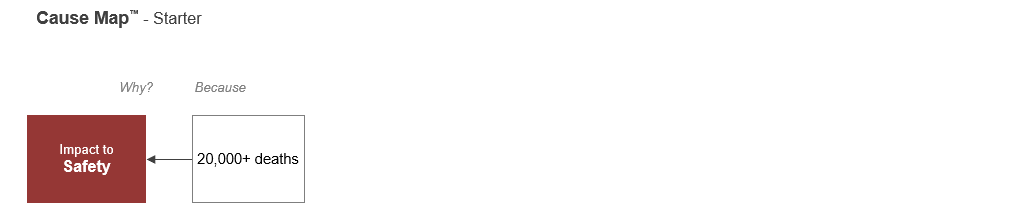
A Cause Map is read by asking “why” at each arrow and answering “because” in the following box. There was an impact to safety. Why? Because there were more than 20,000 deaths. A 5-Why Cause Map diagram might look like this: 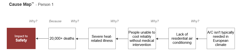
Here, you can see that because air conditioning isn’t typically needed in European homes, many people don’t have an air conditioning unit. When record-breaking temperatures hit near 110 degrees Fahrenheit – or over 115 degrees Fahrenheit in some places – people were unable to find ways to stay cool, and there were tens of thousands of deaths.
Drilling into the “Why?”
By exploring a causal path, you can begin to create solutions. On a Cause Map diagram, this is represented with a solution box above the cause.
Some possible solutions that could apply to this map include:
- Install residential air conditioning.
- Develop more cooling options, such as establishing “cooling centers” for the most vulnerable people when temperatures are extreme.
- Paint walls and roofs with reflective paint, which can repel up to 80% of the sun’s energy, according to Deutsche Welle.
- Add creepers, soil and potted plants on top of homes, which can reduce temperatures inside by several degrees, which in extreme temperatures can make a big difference.
But what happens when you ask multiple people to create 5-Why Cause Map diagrams?
Expanding a Cause Map™ Diagram Expands the Solution Set
Don’t limit your investigation to five causes, expand it until your issue is sufficiently understood so that risk can be reduced to an acceptable level. When you ask several people for their causes, you'll get a more thorough explanation of the issue.
For example, if a second person were to complete a diagram of the heat wave, it might be more related to medical care for people who need treatment for heat-related illnesses. 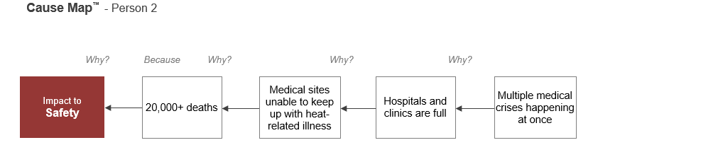
Person 2 started with 20,000 deaths, but their set of causes included the inability of medical sites to keep up with heat-related illnesses, full hospitals and clinics and the combination of medical crises (the heat wave and COVID-19) happening at once.
Solutions to add to your set could include:
- Building more hospitals and clinics or staff pop-ups or emergency clinics during public health emergencies.
- Attempt to keep people out of hospitals by educating them of who is most at risk and signs of heat stroke, as well as preventive measures like staying hydrated and staying out of the sun during the hottest hours.
- Create an action plan that includes coordinated responses by officials, heat alerts, warnings delivered by multiple means, and advertisements in public spaces.
Note that Person 2 only listed four causes. That’s ok. There’s no magic in the number five. Combined, the two maps create an 8-Why Cause Map diagram with a deeper, more thorough set of solutions.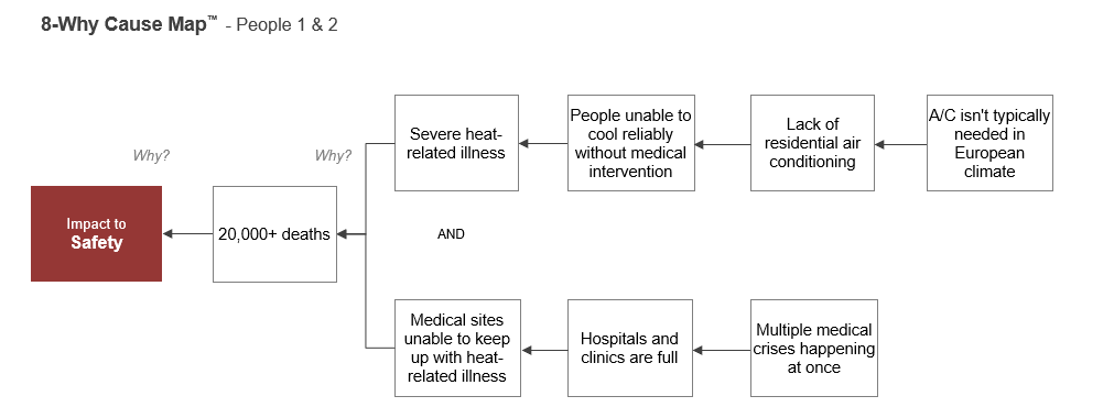
When you combine Cause Map diagrams, you’ll notice there’s an “AND” between the causal paths. That’s because both causes had to occur for the impact to safety to take place. People were unable to cool reliably without medical intervention AND hospitals and clinics were full. To help keep the issue from happening again, you don’t have to provide or implement solutions to all causes, just enough to sufficiently reduce risk and recurrence. Any cause on a map can be expanded, and as it is, more solutions emerge.
Learn How to Use This Valuable Tool Effectively
If you’re interested in seeing an expanded example, check out Part 2, where we show how this Cause Map diagram could continue to take shape.
No company or organization is without issues. From daily issues that erode the enjoyment of your work environment to more significant issues that impact the health and safety of employees and the public, starting your investigation with a 5-Why Cause Map is not only smart, but it could save your company time, money, and the headache of legal repercussions down the road.
Join our 5-Why Cause Mapping Root Cause Analysis Online Short Course to learn how to apply cause-and-effect thinking to break down any problem.